YouTube Thumbnail Fonts: A Practical Readability Guide

Written by SRGE
We build thumbnail workflows for creators and publish practical guidance based on the product work and sources cited in each article.
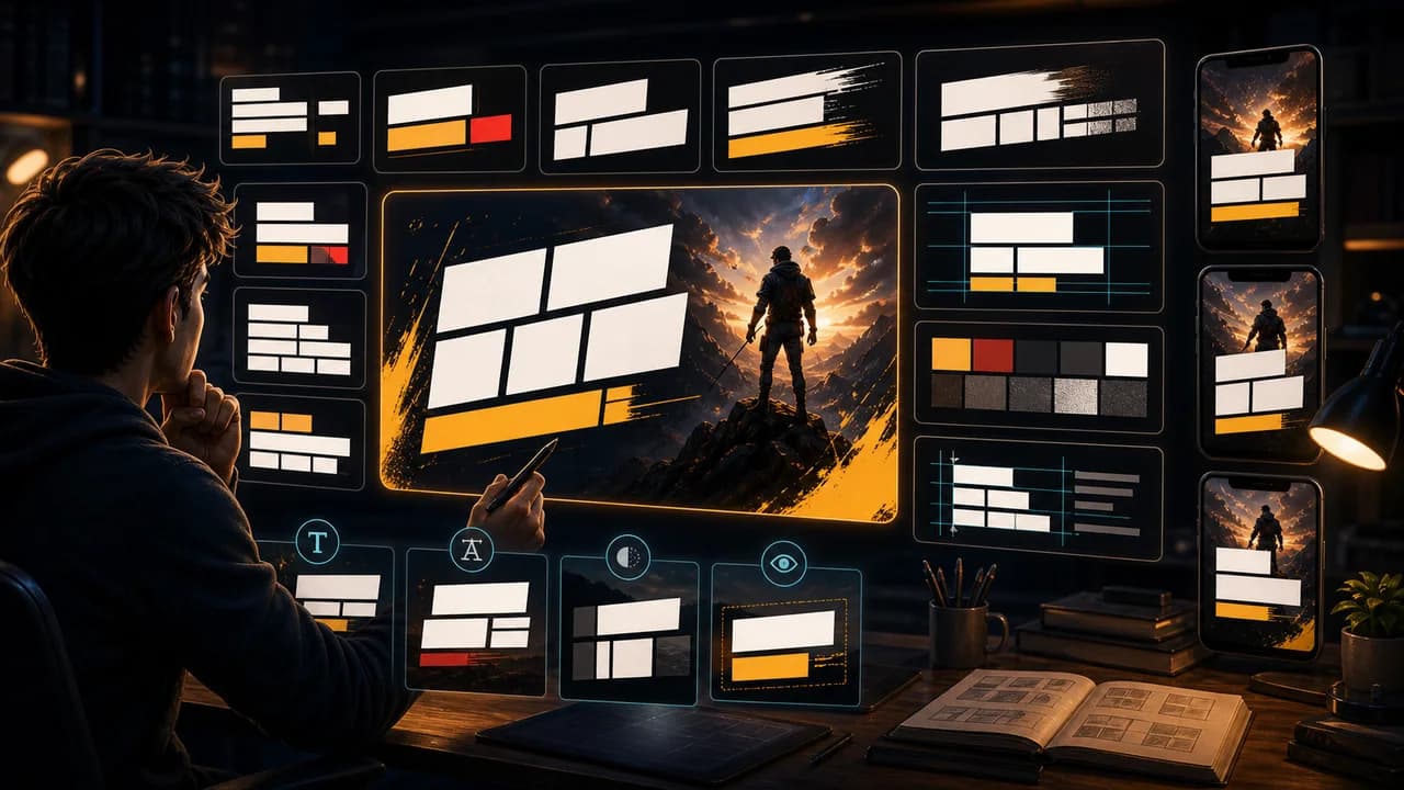
The best YouTube thumbnail font is rarely the most interesting font in your library. It is the one that stays readable when the image is small, compressed, and surrounded by competing videos.
The useful goal is not to chase a universal thumbnail formula. It is to make the video's promise understandable at feed size, keep the packaging honest, and give yourself more than one strong direction to compare before publishing.
Fact-checked on 7 July 2026 against YouTube's thumbnail and title tips, custom thumbnail requirements, title and thumbnail testing documentation, and YouTube's spam, deceptive practices, and scams policy. The examples below are creative strategy guidance, not performance guarantees.
What people searching for YouTube thumbnail fonts really need
Searchers often want a list of font names. A better answer is to understand what makes a font work in thumbnails: weight, spacing, contrast, shape, and restraint.
Principles that make the thumbnail easier to click
- Choose shape before style: Clear letter shapes beat decorative personality when the phrase has to be read fast.
- Use weight intentionally: Bold fonts help, but extremely heavy type can fill in, crowd letters, or overpower the subject.
- Give text a quiet home: Even a strong font fails over a busy background without shadow, outline, block, or negative space.
- Use fewer words: Font choice cannot save a phrase that is too long for the thumbnail.
A practical workflow
- Write the shortest phrase: Pick the words before choosing a font. The phrase should earn its space.
- Choose a readable category: Start with bold sans-serif, condensed sans-serif, or chunky display type before trying decorative options.
- Create hierarchy: If there are two words, decide which one matters more and make that obvious.
- Preview it small: If letters merge at mobile size, increase spacing, simplify the font, or reduce the word count.
Thumbnail angles and prompts to try
Use these as starting points in SRGE's idea workflow or the AI YouTube thumbnail generator. The best option should make sense before the title is read and still feel accurate after the viewer watches the video.
1. Bold sans-serif label
Use when the text must be read immediately and should not carry much personality.
2. Condensed impact phrase
Use when the phrase is short and vertical space is limited.
3. Outline for separation
Use when the subject and background colors make flat text hard to read.
4. Number-first hierarchy
Use when a number is the proof or structure of the video.
5. No-font alternative
Sometimes the best typography decision is to remove text and make the visual clearer.
Common mistakes to avoid
- Using thin script or decorative fonts because they look premium at full size.
- Stacking too many words with the same size and weight.
- Putting white text over a bright or detailed background without separation.
- Changing font styles every video until the channel feels inconsistent.
Before you publish
YouTube's current guidance recommends thinking about the target audience, using familiar or emotionally clear features, keeping text easy to read, avoiding overly complex designs, and reviewing analytics after publishing. Eligible creators can also test up to three title, thumbnail, or title-and-thumbnail combinations in YouTube Studio; the winning option is selected by watch-time share, not CTR alone.
- Can the phrase be read at mobile feed size?
- Is there one obvious word or number hierarchy?
- Does the type support the visual instead of covering it?
- Would a no-text version be clearer?
For the bigger picture, read how to make YouTube thumbnails that get clicks and, when you have multiple directions, our guide to A/B testing YouTube thumbnails.
If a concept is close but not clear enough, run the image through the YouTube thumbnail analyzer, then regenerate or refine it in the AI YouTube thumbnail generator.
Want better type options? Use SRGE to generate text-led and no-text thumbnail variants so you can see whether the font is helping or just filling space.
Keep reading