Travel Vlog Thumbnail Ideas for Clearer Adventures

Written by SRGE
We build thumbnail workflows for creators and publish practical guidance based on the product work and sources cited in each article.
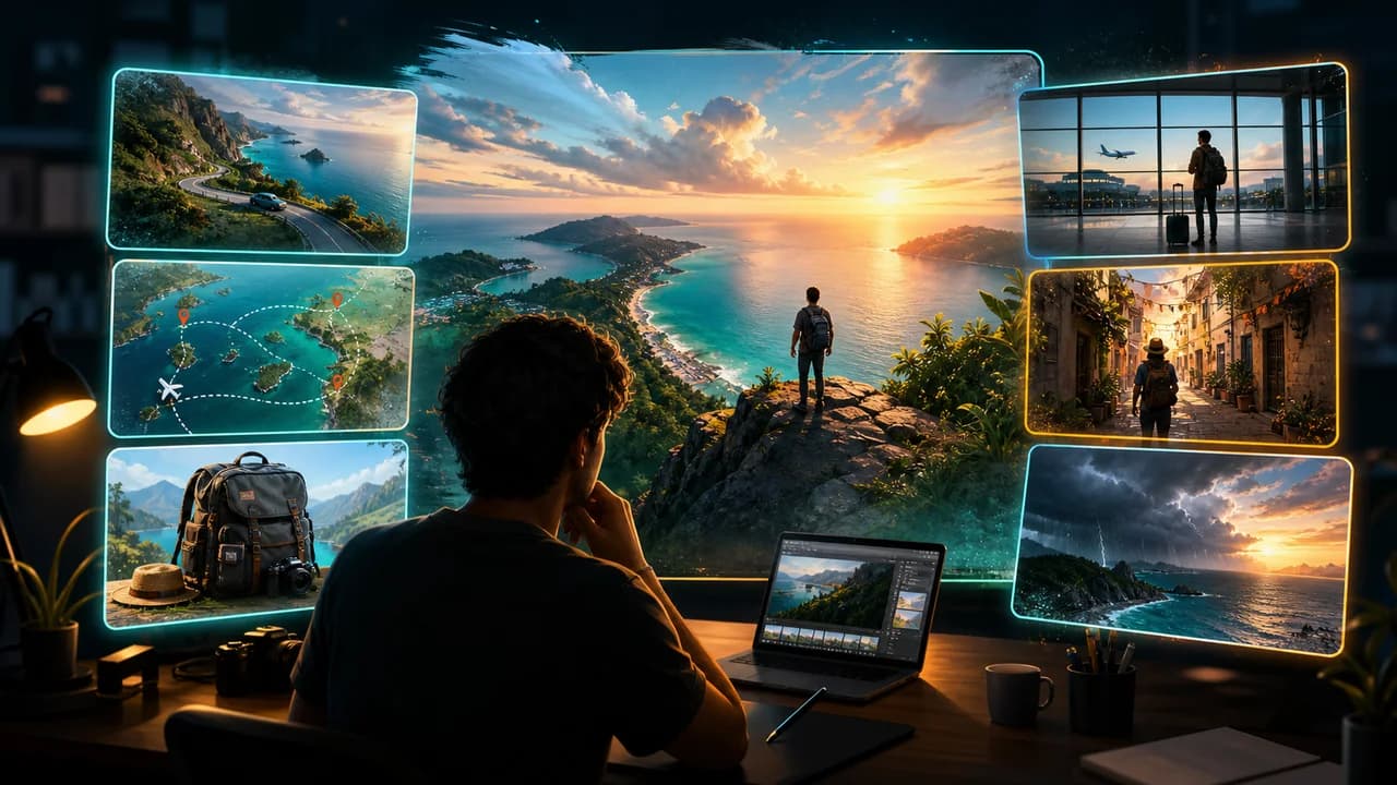
Travel thumbnails do not have to show every place in the trip. They need one clear reason to care: a destination reveal, a problem, a price surprise, a route, a contrast, or a moment the viewer wants to experience.
The goal is not to copy a thumbnail style from another creator. The goal is to choose a visual promise that fits the viewer's reason for clicking in this niche, then make that promise readable at feed size.
Fact-checked on 24 June 2026 against YouTube's thumbnail and title tips, custom thumbnail requirements, and title and thumbnail testing documentation. The examples below are creative strategy prompts, not performance guarantees.
What works in travel vlog thumbnails
Travel viewers may be planning a trip, comparing destinations, looking for inspiration, or just watching a story unfold. The thumbnail should quickly signal whether the video is practical, emotional, luxurious, chaotic, or discovery-led.
- Make the place readable: A clear skyline, landscape, room, road, dish, or street detail is stronger than a collage of tiny vacation moments.
- Show the travel tension: Missed trains, bad hotels, weather shifts, hidden costs, and route decisions create a reason to click when they are visually specific.
- Use scale and distance: A small traveler facing a large view, mountain, city, ship, or road can make the destination feel cinematic.
- Avoid fake location drama: Do not exaggerate danger, cost, or exclusivity beyond what the video actually shows.
10 travel vlog thumbnail ideas
Use these as starting angles inside SRGE's thumbnail idea workflow. The best version should match the actual video, the title, and the viewer's expectation after the click.
1. The destination reveal
Lead with one unmistakable visual from the destination instead of squeezing the whole itinerary into one frame.
2. Route map without tiny labels
Show movement with a simple line, vehicle, or sequence of locations rather than relying on unreadable map details.
3. Expectation versus reality
Use a comparison when the video corrects a travel myth, tourist trap, hotel promise, or itinerary assumption.
4. The hidden street
For hidden gems, make the viewer feel like they are being shown a doorway, alley, beach path, or market corner they would miss.
5. Hotel room reveal
Hotel videos work when the room, view, or surprise is the subject. Avoid making the creator and bed compete equally.
6. Budget shock
If price is the hook, use visual contrast: luxury-looking result with simple belongings, or costly problem with a clear object.
7. Bad weather changed the plan
Weather makes the story visible. Show the contrast between the planned scene and what actually happened.
8. First time arriving
Airport, train station, ferry dock, or bus arrival thumbnails can work when arrival emotion and place are obvious.
9. Food as destination
If the trip is food-led, make the dish and setting carry the place instead of using a generic landscape.
10. The one decision
A fork in the road, missed transport, wrong hotel, or last-minute route change gives the viewer a story question.
Common mistakes to avoid
- Using a postcard landscape that does not show what makes this video different.
- Packing ten tiny trip photos into one collage.
- Making the thumbnail look like a luxury trip when the video is a practical guide.
- Exaggerating risk, danger, or location exclusivity beyond the footage.
- Using recognizable brand signs, maps, or copyrighted imagery when a generic visual would work.
How to turn the idea into a stronger thumbnail
- Create one version led by place and one led by problem or surprise.
- Check whether the destination is recognizable as a feeling, even if the exact place is not named.
- Keep any route or map shape simple enough to understand without labels.
- If testing in YouTube Studio, compare practical value against emotional adventure, not just two scenic crops.
YouTube's current guidance recommends thinking about the target audience, using familiar or emotionally clear features, keeping text easy to read, avoiding overly complex designs, and reviewing analytics after publishing. Eligible creators can also test up to three title, thumbnail, or title-and-thumbnail combinations in YouTube Studio; the winning option is selected by watch-time share, not CTR alone.
For the wider strategy behind these ideas, read how to make YouTube thumbnails that get clicks. If you plan to publish multiple options, pair this article with our guide to A/B testing YouTube thumbnails.
If the first version feels close but not strong enough, run it through the YouTube thumbnail analyzer. Then regenerate or refine the idea in the AI YouTube thumbnail generator.
Want faster travel concepts? Use SRGE to turn the destination, route, hotel, surprise, or mistake into thumbnail options before editing your vlog.
Keep reading