Food YouTube Thumbnail Ideas That Make Recipes Click

Written by SRGE
We build thumbnail workflows for creators and publish practical guidance based on the product work and sources cited in each article.
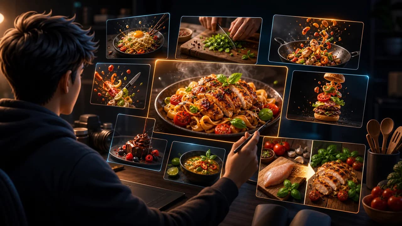
Food thumbnails usually win or lose on one question: can the viewer understand the craving, texture, result, or problem before they read the title? A beautiful plate helps, but a clear food promise helps more.
The goal is not to copy a thumbnail style from another creator. The goal is to choose a visual promise that fits the viewer's reason for clicking in this niche, then make that promise readable at feed size.
Fact-checked on 24 June 2026 against YouTube's thumbnail and title tips, custom thumbnail requirements, and title and thumbnail testing documentation. The examples below are creative strategy prompts, not performance guarantees.
What works in food and cooking YouTube thumbnails
Food viewers scan quickly for recipes they want to cook, results they want to taste, mistakes they want to avoid, or comparisons they are curious about. Your thumbnail should make the dish and the reason to click obvious.
- Lead with the finished result: For recipes, the final dish is usually the promise. Make it large, appetizing, and visibly connected to the title.
- Use texture as the hook: Steam, stretch, crunch, sauce, crisp edges, and clean slices often communicate more than a crowded table scene.
- Show the transformation: Raw-to-finished, messy-to-clean, cheap-to-impressive, or failed-to-fixed visuals give the viewer a story in one frame.
- Keep food honest: Do not show a result that the recipe never produces. Viewers may click once, but misleading food packaging hurts trust.
10 food and cooking YouTube thumbnail ideas
Use these as starting angles inside SRGE's thumbnail idea workflow. The best version should match the actual video, the title, and the viewer's expectation after the click.
1. The final bite close-up
Make one fork, slice, or spoonful carry the whole video. This works when texture is the strongest reason to click.
2. Raw ingredients to finished dish
Use a simple before-and-after layout when the video teaches a full recipe or meal-prep workflow.
3. The one mistake
Package troubleshooting videos around the visible problem: burnt bottom, split sauce, dry cake, soggy crust, or overmixed dough.
4. Cheap meal that looks expensive
Budget cooking benefits from value contrast. Show the plated result looking impressive without implying fake ingredients.
5. The impossible texture
Crispy, fluffy, stretchy, creamy, and glossy textures can become the focal hook if the crop is close enough.
6. Taste test face plus product lineup
For comparisons, show the decision being made. Keep the products generic or label-free unless you have usage rights.
7. Tiny kitchen, big result
If the video solves a constraint, show the constraint and the payoff together: small kitchen, limited tools, one pan, or no oven.
8. Meal prep grid
Meal-prep videos need organization. A neat grid of containers can make the value clear, but avoid making every box equally important.
9. Restaurant copycat reveal
The hook is the comparison, not a brand logo. Show homemade vs. restaurant-style plating without copying trademarks.
10. The secret step
Use a mystery action when one technique changes the result: resting dough, searing first, chilling batter, or adding sauce at the end.
Common mistakes to avoid
- Cropping so wide that the food looks small and flat.
- Using too many dishes, ingredients, hands, tools, and labels in one thumbnail.
- Showing a final result that is more polished than the recipe honestly delivers.
- Relying on tiny handwritten labels or recipe cards that disappear on mobile.
- Using recognizable packaged products or restaurant branding without permission.
How to turn the idea into a stronger thumbnail
- Create one version led by the finished result and one led by the transformation.
- Test whether the food still looks appetizing when reduced to mobile feed size.
- Review color contrast before adding garnish, props, or background detail.
- If testing in YouTube Studio, make each option compare a different promise: craving, speed, mistake, or value.
YouTube's current guidance recommends thinking about the target audience, using familiar or emotionally clear features, keeping text easy to read, avoiding overly complex designs, and reviewing analytics after publishing. Eligible creators can also test up to three title, thumbnail, or title-and-thumbnail combinations in YouTube Studio; the winning option is selected by watch-time share, not CTR alone.
For the wider strategy behind these ideas, read how to make YouTube thumbnails that get clicks. If you plan to publish multiple options, pair this article with our guide to A/B testing YouTube thumbnails.
If the first version feels close but not strong enough, run it through the YouTube thumbnail analyzer. Then regenerate or refine the idea in the AI YouTube thumbnail generator.
Want faster recipe concepts? Use SRGE to turn the dish, texture, mistake, or transformation into multiple food thumbnail directions before you start designing.
Keep reading