Faceless YouTube Thumbnail Ideas That Still Feel Human

Written by SRGE
We build thumbnail workflows for creators and publish practical guidance based on the product work and sources cited in each article.
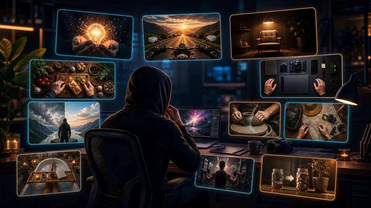
A faceless thumbnail does not have to feel anonymous. The trick is to replace facial emotion with a readable object, situation, transformation, or decision the viewer can understand instantly.
The useful goal is not to chase a universal thumbnail formula. It is to make the video's promise understandable at feed size, keep the packaging honest, and give yourself more than one strong direction to compare before publishing.
Fact-checked on 7 July 2026 against YouTube's thumbnail and title tips, custom thumbnail requirements, title and thumbnail testing documentation, and YouTube's spam, deceptive practices, and scams policy. The examples below are creative strategy guidance, not performance guarantees.
What people searching for faceless YouTube thumbnail ideas really need
Most people searching this keyword are not anti-personality; they are trying to build a channel without becoming the visual brand. They need thumbnail ideas that still feel specific, emotional, and trustworthy when the creator is not on screen.
Principles that make the thumbnail easier to click
- Make an object carry the emotion: A cracked phone, highlighted spreadsheet, empty chair, glowing map, or messy desk can create curiosity when it clearly relates to the video.
- Use hands only when they explain action: Hands can make a tutorial feel human, but they should point, hold, compare, build, or reveal something meaningful.
- Show the before and after: Faceless channels often do well with proof: messy-to-clean, old-to-new, vague-to-clear, broken-to-fixed, or empty-to-finished.
- Let the title do less: If the title explains the whole premise, the thumbnail can focus on the emotional proof or visual contrast.
A practical workflow
- Write the viewer question: Ask what the viewer wants answered: Which tool wins? What changed? What went wrong? Is this worth it?
- Choose one physical anchor: Pick the object, screen, result, or scene that best represents that question.
- Add one human clue: Use a hand, shadow, empty chair, camera view, or point-of-view crop if the thumbnail needs scale or emotion.
- Remove the decoration: Faceless thumbnails get weak when every prop is included. Keep the visual promise simple enough for mobile.
Thumbnail angles and prompts to try
Use these as starting points in SRGE's idea workflow or the AI YouTube thumbnail generator. The best option should make sense before the title is read and still feel accurate after the viewer watches the video.
1. The object under pressure
Show the product, file, tool, or result at the exact moment something is at stake.
2. The empty chair mystery
Use absence as the hook when the video is about quitting, disappearing, burnout, remote work, or a story without a host.
3. Hands reveal the result
A reveal shot can replace a reaction face if the result is visually satisfying enough.
4. The comparison board
For reviews and essays, use two or three clear options instead of a face reacting to them.
5. The POV problem
Point-of-view crops help viewers imagine themselves inside the problem.
Common mistakes to avoid
- Replacing a face with a random stock object that has no emotional role.
- Using too many icons, arrows, screenshots, and props in one frame.
- Making the thumbnail so anonymous that it could belong to any video.
- Hiding the main result behind decorative bokeh or fake depth effects.
Before you publish
YouTube's current guidance recommends thinking about the target audience, using familiar or emotionally clear features, keeping text easy to read, avoiding overly complex designs, and reviewing analytics after publishing. Eligible creators can also test up to three title, thumbnail, or title-and-thumbnail combinations in YouTube Studio; the winning option is selected by watch-time share, not CTR alone.
- Can a viewer describe the object, problem, or result in one sentence?
- Would the thumbnail still work if the title were temporarily hidden?
- Does the faceless style feel intentional rather than unfinished?
- Does the image accurately represent what the video actually delivers?
For the bigger picture, read how to make YouTube thumbnails that get clicks and, when you have multiple directions, our guide to A/B testing YouTube thumbnails.
If a concept is close but not clear enough, run the image through the YouTube thumbnail analyzer, then regenerate or refine it in the AI YouTube thumbnail generator.
Want more faceless options? Use SRGE to generate object-led, POV, comparison, and before-and-after directions from the same video idea.
Keep reading