Beauty Thumbnail Ideas for Makeup and Skincare Videos

Written by SRGE
We build thumbnail workflows for creators and publish practical guidance based on the product work and sources cited in each article.
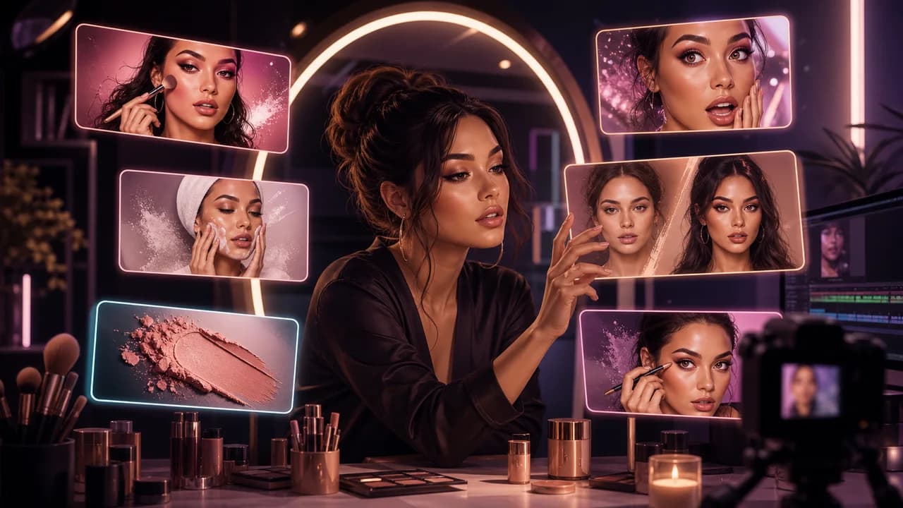
Beauty thumbnails work when the viewer can understand the transformation, product question, texture, routine, or mistake immediately. The face matters, but the promise behind the face matters more.
The goal is not to copy a thumbnail style from another creator. The goal is to choose a visual promise that fits the viewer's reason for clicking in this niche, then make that promise readable at feed size.
Fact-checked on 24 June 2026 against YouTube's thumbnail and title tips, custom thumbnail requirements, and title and thumbnail testing documentation. The examples below are creative strategy prompts, not performance guarantees.
What works in beauty and makeup YouTube thumbnails
Beauty viewers often compare tutorials, product reviews, routines, and transformations while scanning very polished visuals. The thumbnail should make the result or question clear without relying on unrealistic perfection.
- Make the transformation specific: Before-and-after only works when the change is visible and honest: base makeup, eye look, hair, skin finish, or styling.
- Use product texture carefully: Swatches, brushes, applicators, and close-up texture can carry the click if they are large enough and not crowded by labels.
- Keep one expression: Confident, surprised, disappointed, or curious is easier to read than a busy collage of faces.
- Avoid impossible claims: Do not imply medical, permanent, or guaranteed results unless the video and evidence support that claim.
10 beauty and makeup YouTube thumbnail ideas
Use these as starting angles inside SRGE's thumbnail idea workflow. The best version should match the actual video, the title, and the viewer's expectation after the click.
1. Half-face transformation
A clean half-finished look can show the value of the tutorial without needing text or multiple panels.
2. One product, three finishes
For reviews, show the comparison visually: matte versus glow, sheer versus full, or shade differences.
3. Routine timeline
Skincare and haircare routines benefit from a simple progression instead of a pile of products.
4. The makeup mistake
Use a visible, fixable problem such as cakey base, uneven liner, harsh contour, patchy blush, or smudged mascara.
5. Drugstore versus luxury look
The hook is value. Show the two results, not tiny product packaging or price tags.
6. Wear test moment
Show time and condition visually: heat, long day, flash photo, or close-up texture at the end of wear.
7. Color shock
A bold shade, unusual palette, or unexpected lipstick can be the focal point if the face remains clean and readable.
8. Beginner-friendly kit
Tutorials for beginners should feel simple. Show fewer items and a clear finished look.
9. Skincare myth test
When testing a viral trend, show the question without copying a platform trend image or making a medical promise.
10. One brush changed it
For technique videos, focus on the tool and the visible improvement it creates.
Common mistakes to avoid
- Using product labels so small they become noise on mobile.
- Over-smoothing skin until the result looks fake or misleading.
- Making medical or guaranteed-result claims in the visual packaging.
- Showing too many palettes, brushes, bottles, faces, and swatches at once.
- Using brand packaging or influencer imagery without rights.
How to turn the idea into a stronger thumbnail
- Create one version led by transformation and one led by product question.
- Shrink the thumbnail and check whether the face, texture, or comparison still reads.
- Keep any skin or hair result honest to the footage and lighting.
- If testing in YouTube Studio, compare different viewer motivations: tutorial, review, routine, or mistake fix.
YouTube's current guidance recommends thinking about the target audience, using familiar or emotionally clear features, keeping text easy to read, avoiding overly complex designs, and reviewing analytics after publishing. Eligible creators can also test up to three title, thumbnail, or title-and-thumbnail combinations in YouTube Studio; the winning option is selected by watch-time share, not CTR alone.
For the wider strategy behind these ideas, read how to make YouTube thumbnails that get clicks. If you plan to publish multiple options, pair this article with our guide to A/B testing YouTube thumbnails.
If the first version feels close but not strong enough, run it through the YouTube thumbnail analyzer. Then regenerate or refine the idea in the AI YouTube thumbnail generator.
Want faster beauty concepts? Use SRGE to turn the look, routine, product test, or mistake into multiple thumbnail directions before you start editing.
Keep reading