MrBeast Thumbnail Style: What to Borrow Without Copying It

Written by SRGE
We build thumbnail workflows for creators and publish practical guidance based on the product work and sources cited in each article.
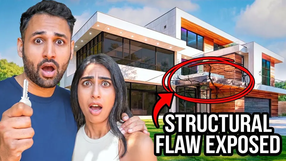
Search for "MrBeast thumbnail style" and you will find a lot of recipes: giant face, bright background, money, bold text. Some of that describes individual thumbnails. None of it guarantees that the same design will suit your video or your audience.
This post is deliberately not an audit of every upload or a claim that one formula explains a huge channel. It is a set of observations you can make yourself by looking through the current MrBeast videos page, then testing what translates to your own work.
The transferable lesson: simplify the premise
The strongest lesson is not a font or a facial expression. It is that the thumbnail usually commits to a simple visual question: an extreme challenge, a huge object, an unusual location, or an outcome the viewer wants explained. You can understand the premise before you read a detailed description.
This matters for small channels too. A repair channel can show the broken component and the result. A software channel can show the comparison that matters. A food channel can show the dish and the verdict. None of those videos needs a stunt-channel costume.

What is worth testing
One first read
Give the viewer one obvious starting point. It might be a person, an object, a number, or the contrast between two outcomes. If four elements demand equal attention, the premise becomes work.
Scale that matches the story
Big objects and expressive reactions make sense when the video itself delivers scale or emotion. If the content is a careful comparison or an expert tutorial, a quieter image may build more trust. The thumbnail is a promise, not a costume.
Contrast with a purpose
Bright colors can separate a subject from a busy feed, but a consistent channel look can matter more than using someone else's palette. Choose contrast that makes your subject readable, then keep the visual cues your viewers already associate with you.

What not to copy blindly
- Reaction without context. An extreme expression only helps when the viewer can tell what caused it.
- Spectacle your video does not deliver. If the thumbnail suggests a bigger event than the video contains, the problem is not the art quality. It is the expectation.
- A borrowed identity. Repeating another channel's exact composition and look can make your videos harder to recognize as your own.
YouTube's own guidance is useful here: it recommends judging packaging alongside viewer satisfaction signals rather than chasing click-through rate alone. A click matters most when the video keeps the promise that earned it.
Further reading: YouTube Help on CTR and clickbait.
A better adaptation exercise
Pick one of your upcoming videos and make three directions, all faithful to the content:
- A simple outcome image: show the thing viewers will want to see completed or tested.
- A stakes-driven image: show what could go wrong or why the result matters.
- A channel-native image: use the composition, color, and tone that regular viewers already recognize from your uploads.
Compare them at feed size, then use YouTube's testing tools where available. This teaches you more about your audience than reproducing a famous channel's surface styling.
How SRGE fits into the process
In SRGE, you can explore those directions from one prompt, bring in your Visual Identity, and reuse a Style Profile so a bolder concept still feels like it belongs on your channel. You can then check the draft in the thumbnail analyzer before deciding which variations deserve a real YouTube test.
The aim is not to manufacture a "MrBeast thumbnail." It is to take a useful principle - a clear premise presented quickly - and find the version your audience believes from you.
Testing a bolder direction for your next upload? Try SRGE and make a few versions that preserve your own style while sharpening the premise.
Keep reading